Dos Equis new packaging blends Mexican heritage with progressive fusion of cultures
New bottles, cans will rollout throughout fall
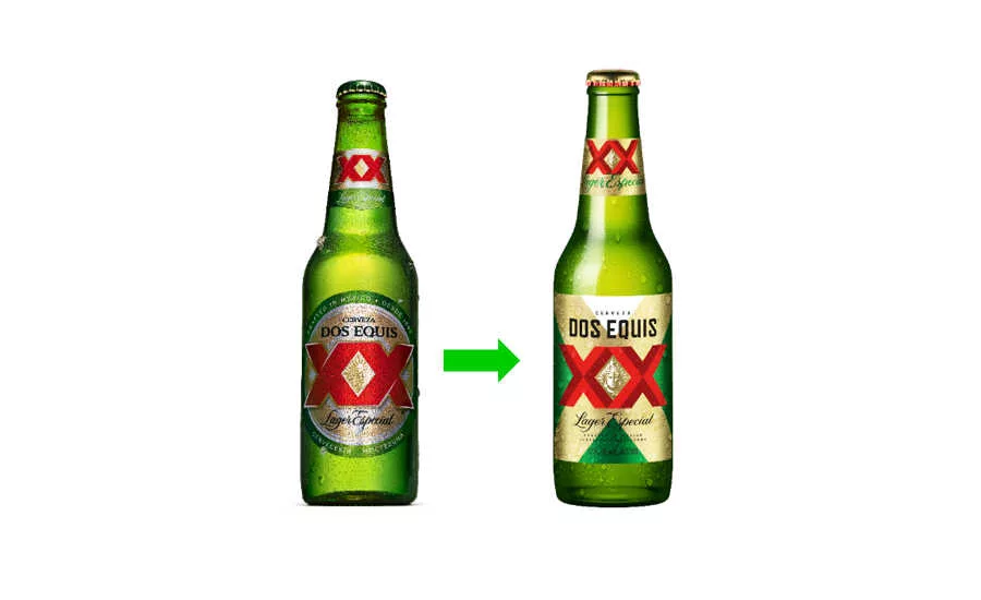
Dos Equis, a brand of White Plains, N.Y.-based HEINEKEN USA, announced the latest updates to its packaging as part of an overall brand refresh to maintain relevance with today’s consumer.
The new design is modern and incorporates its Mexican heritage with a progressive fusion of cultures, the company says. It puts increased focus on the brand’s iconic colors and XX symbol. The new cues aim to augment standout, modernity, and the brand’s premium positioning. Shoppers can find the new Dos Equis Lager bottles in stores beginning September 2020, followed by Lager cans in October and Ambar Especial bottles in November.
“The new packaging draws the consumer in with its bold simplicity and eye-catching detail,” says Ligia Patrocinio, senior brand director for Dos Equis, in a statement. “A hint of contrasting color conveys pride and confidence while drawing focus to Moctezuma, where the brand has its roots and where its expressive personality was born. Today, Dos Equis is entering a new era; we’re keeping it interesting with a design evolution that’s a progressive and refreshing twist on a proud tradition.”
Research conducted in advance of the enhancements showed significant improvement in all key packaging test metrics; including standout, find accuracy and time, as well as premium and modern associations and preference share for both bottles and cans.
The new packaging design is the first step in a complete brand evolution that will affect all brand touch points, it adds.
Looking for a reprint of this article?
From high-res PDFs to custom plaques, order your copy today!


