Bigelow Tea redesigns boxes to be communication tools
The Bigelow Tea Co. redesigned its packaging to better share information with consumers. While redesigning the boxes for a more unified look, the company also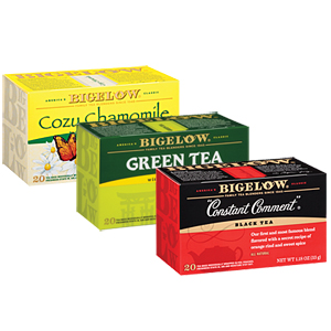 examined how it could make the boxes work harder as communication tools. To that end, each panel of the Bigelow box was carefully reviewed as the redesign progressed. The result is a modern look that still connects to the brand’s visual heritage of using color to identify flavor while further engaging consumers with company stories, fun facts, and information about the tea, the company says. Bigelow’s label also has been enhanced to make it easier to spot on the shelf, it says. In addition, the new boxes are designed to be easier to open, with a tuck cap for easier closing and reopening, it adds.
Looking for a reprint of this article?
From high-res PDFs to custom plaques, order your copy today!
