You have 0 Articles Left This Month. Register Today for Unlimited Access.
Get our new eMagazine delivered to your inbox every month.
Stay in the know on the latest beverage industry marketplace trends.
SUBSCRIBE TODAY!Copyright ©2024. All Rights Reserved BNP Media.
Design, CMS, Hosting & Web Development :: ePublishing
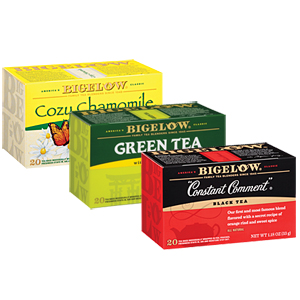
 examined how it could make the boxes work harder as communication tools. To that end, each panel of the Bigelow box was carefully reviewed as the redesign progressed. The result is a modern look that still connects to the brand’s visual heritage of using color to identify flavor while further engaging consumers with company stories, fun facts, and information about the tea, the company says. Bigelow’s label also has been enhanced to make it easier to spot on the shelf, it says. In addition, the new boxes are designed to be easier to open, with a tuck cap for easier closing and reopening, it adds.