Oliver Winery’s Soft Wine Collection debuts new labels
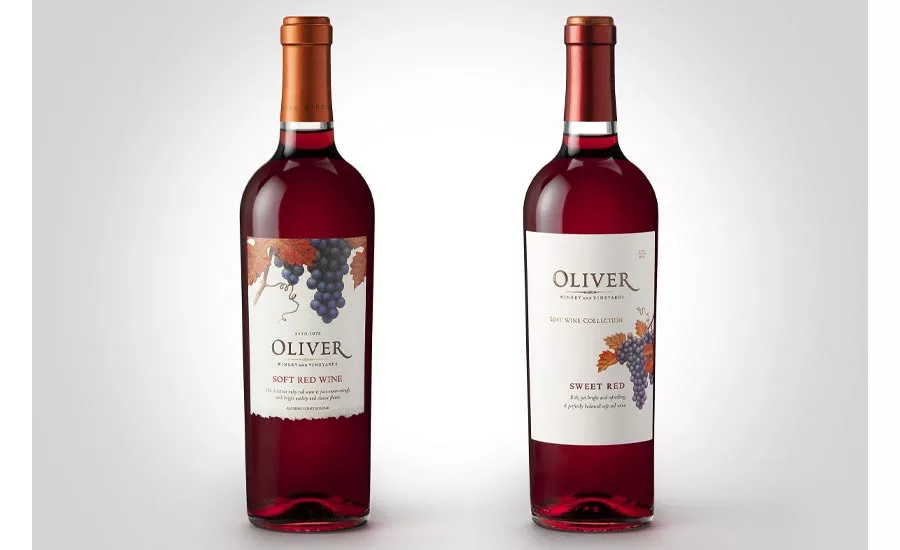
With the goal of expanding retail distribution and inviting more consumers to explore its range of fruit-forward wines, Oliver Winery and Vineyards engaged Affinity Creative to carefully and delicately evolve the look of its The Soft Collection line of wines. “Through a category audit, we determined that it was not only okay to identify the wines as ‘Sweet Red’ or ‘Sweet Rosé’; the consumer actually preferred and appreciated this straightforward communication of flavor profile,” said Cynthia Sterling, creative director at Affinity Creative Group, in a statement. The Affinity creative team made several other adjustments and embellishments to the label design. Close inspection of the “after” label reveals a new order to the information shown, or what designers call the “label hierarchy.” Now, there is increased attention on the Oliver brand mark along with a supporting line describing this grouping as The Soft Wine Collection. Affinity Creative Group designers also shifted the location of the fruit so that the label no longer is top-heavy, allowing the Oliver name to take center stage, it says. The addition of copper foil treatments adds a glimmer effect that catches the light, serves as a quality cue and increases shelf impact in the retail environment, it adds. The elimination of the torn or deckled edge on the bottom of the previous labels helps project a fresher, cleaner and more modern impression, it says.
Looking for a reprint of this article?
From high-res PDFs to custom plaques, order your copy today!


