The Bitter Housewife Cocktail Bitters Get a New Look
All Labels Updated to Match Newly Launched Canned Bitters & Soda
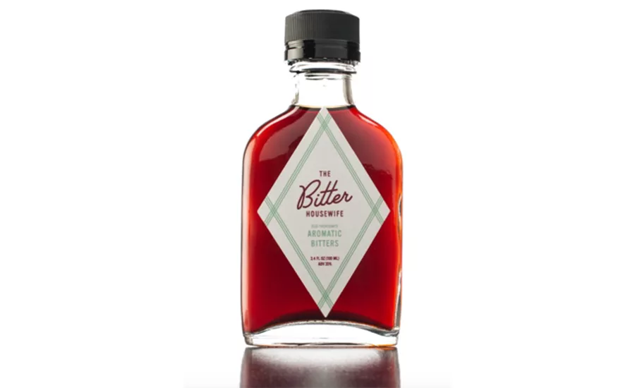
Bitter Housewife Bitters - new logo
The Bitter Housewife, Portland, Ore., has an updated logo and a brightened color palette after six years on the market. The brand worked with Portland, Ore.-based agency High-Proof Creative to design the packaging for the newly launched Bitters & Soda.
“We decided it was time for a new logo that had a cleaner, modern look,” the company said, in a statement. “There is still a hint of the retro vibe that customers know and love, but the new rendition feels more timeless.”
The new logo has been incorporated into the diamond shaped labels that adorn the 100-ml flasks of cocktail bitters. The color palette for each of the six flavors of bitter also has been updated to carry through the modernized look.
“The brand has definitely evolved over the years and we feel this new look is a better visualization of how we hope to evolve in the coming years,” said co-founder Genevieve
Brazelton in a statement. “The changes are subtle enough that no one will have trouble recognizing us, but there’s a new vibrancy that will call from the shelf with a bit more force.”
Looking for a reprint of this article?
From high-res PDFs to custom plaques, order your copy today!