Long Island Iced Tea develops summer-themed image
Fresh fruit imagery highlight tropical flavors
Long Island Iced Tea and Tigre Creative Inc. collaborated to develop a new brand identity and design for the ready-to-drink iced tea brand. “We set the creative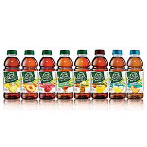 direction by establishing the new brandmark and packaging,” said Tammy Vaserstein, creative and principal for Tigre, in a statement. “By capitalizing on the enticing image of summer fun and providing a bold, new image for the brand, it now stands out in a crowded category.” The new brandmark features a dark green square with white typography with rough edges in a sans-serif font. The green color is the only element remaining from the previous packaging, according to Philip Thomas, chief executive officer of Long Island Iced Tea. The label also contains fresh fruit imagery and color-coded flavor banding. “The new design reflects a warmth and familiarity tied to summer weekends,” Thomas said in a statement. “The clapboard siding that serves as the background suggests a beach home or boardwalk; the logo reflects a worn sign you might find marking a charming bed-and-breakfast in Sag Harbor.”
Looking for a reprint of this article?
From high-res PDFs to custom plaques, order your copy today!


