Blue Ice's facelift
Blue Ice Vodka, a 21st Century Spirits brand, recently updated its label. Design firm Flowdesign further refined the label to correlate with the distinctive look and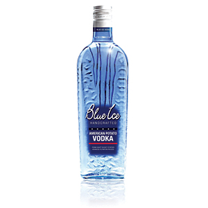 texture of the bottle while maintaining the complementary relationship between the look, feel and taste of the potato-based vodka, the company says. The redesign includes the use of a simpler font, targeted copy and a bolder blue background to help the branding pop, Flowdesign says.
Looking for a reprint of this article?
From high-res PDFs to custom plaques, order your copy today!


