Miller High Life refreshes packaging, logo
Miller High Life, the Champagne of Beers, rolled out refreshed packaging and logo updates that keep the look classic and familiar while refining a few key elements to better connect with longtime fans and today’s beer drinkers. Fans can rest easy knowing that the iconic High Life bottle will not change, the company says.
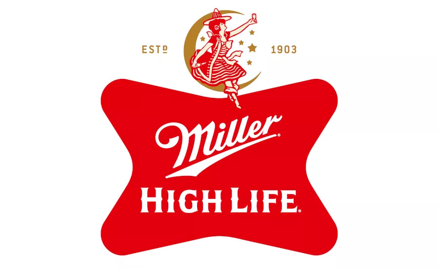
Refreshed elements include crisper colors, the removal of the pin line on the soft cross logo, and a more prominent role for the beloved Girl in the Moon:
• Crisper Colors: High Life retains its iconic red while making the color sharper and more recognizable on shelf.
• Prominent Girl in the Moon: The Girl in the Moon will continue to appear on the neck label of High Life bottles, and with the refreshed identity, will take on a more prominent role across packaging and marketing materials.
The Girl in the Moon has been around since 1907 and has become an enduring icon. As a symbol of the Champagne of Beers, she’s lived everywhere from vintage ads to neon bar signs ― and long before the refreshed identity, she was already part of dive bar culture. Over time, she’s become an icon that people have made their own etched into mirrors and even tattooed by High Life fans. To honor that legacy, the Girl in the Moon now plays a bigger role across the brand’s refreshed packaging and look.
“High Life already belongs in dive bars, behind bar tops, and in the hands of regulars, so this was never about changing what people love,” said Chris Steele, senior director of value brands, Molson Coors Beverage Co. “ “ “ “The updates simply sharpen a few familiar details — from the red and gold colors to the soft cross and the Girl in the Moon — while keeping the same unmistakable High Life character.”
With these changes High Life isn’t becoming something new, it’s becoming more fully itself. The refreshed packaging is designed for the High Life regulars and the next person pulling up a barstool, reinforcing iconic elements while focusing on the character that’s made High
“The Girl in the Moon has been at the heart of High Life for over a century and remains one of the brand’s most recognizable symbols,” Steele said. “Long tied to the timeless, iconic character people love about High Life, the refreshed packaging now gives her a bigger spotlight across the brand.”
Looking for a reprint of this article?
From high-res PDFs to custom plaques, order your copy today!


