A new look for Ommegang Brewery
With a goal of creating a cohesive look to create brand recognition and communicate the quality of its Belgian-style ales, Ommegang Brewery enlisted the help of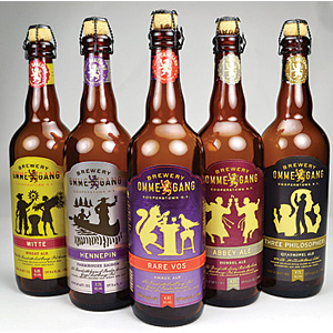 Duffy & Partners, Flower City Printing and AR Metallizing. Duffy & Partners developed the new logo and label that was designed to not only give the line of beer a unified, branded look, but also evoke the look of quality that the Belgian-style ales are known for, the design firm says. Suggesting metalized paper from AR Metallizing, Flower City Printing achieved the luminous, pearly effect Ommegang Brewery and Duffy & Partners wanted for the new labels by playing with different ink draws, the print partner says. (Image courtesy of Ommegang Brewery)
Looking for a reprint of this article?
From high-res PDFs to custom plaques, order your copy today!