Crate propels sustainable packaging with label-less wine
Fourth Wave Wines has forged a new path in sustainable packaging, with its launch of the label-less wine, Crate, designed by sustainable drinks branding specialists Denomination.
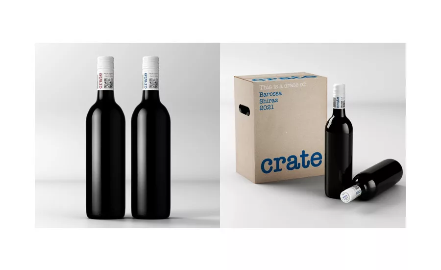
Crate is a high-quality, barrel matured wine produced from some of Australia’s leading red wine regions with a sustainable footprint. The innovative design does away with unsustainable branding materials and optimizes the only necessary packaging components. All the essential brand information is found within the tiny space of a capsule.
“Fourth Wave Wines is constantly striving toward greater sustainability and, with the launch of Crate, is shining a light on alternatives to conventional packaging that use paper labels, an increasingly precious commodity” said Nicholas Crampton, co-owner at Fourth Wave Wines, in a statement. “We enlisted the team at Denomination because they always put sustainability at the heart of everything they do. What they have created is a design that allows the quality of the wine to shine, while stripping away unnecessary waste from the packaging. There’s no label printing, no adhesives, no paper usage, and less energy used on the bottling line with the removal of the label component.”
Environmental concerns have led to a decrease in the use of plastic and paper resources are being used to compensate. This has led to increased pressure on forests, leading to deforestation, according to the company. In addition, in order to apply a paper label to a bottle, a PET liner needs to be used, adding the use of crude oil to the mix, it adds. Crate does away with all this, standing out from the crowd with its sleek, pared-back design.
The spotlight is firmly on the wine, not the packaging. Rowena Curlewis, co-founder of Denomination, says to do this Denomination could only use the wine’s essential components: the bottle and the capsule. “The challenge was finding the most energy efficient choice. Printing on the bottle would have involved using incredibly high temperatures, so we chose the capsule, even though it meant being creative in a smaller space.”
The capsule contains all mandatory information, brand logotype, varietal, region, vintage, legal claims, barcode, brand messaging and a QR code for further information, using the typography to give the illusion of space. The brand clearly lays out its position on the carton: “our planet matters more than our packaging.” It informs the consumer that no label saves energy, no glue saves waste, no paper saves trees.
Looking for a reprint of this article?
From high-res PDFs to custom plaques, order your copy today!


