Clear/Cut Phocus refreshes packaging design

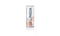
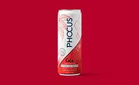
Clear/Cut Phocus (Phocus), the natural energy-providing sparkling water, has refreshed how it will appear on store shelves with new designs for its cans and four-packs.
“Phocus sparkling water is a beverage that can be found in the aisles of sparkling water, energy, or functional beverage, so it is important that we brought more pop to our packaging to help customers find their Phocus,” said Clear/Cut Phocus Chief Executive Officer Todd Creek.
The new design brings in bolder colors and typefaces, with each color designating a specific Phocus flavor variety, the company says. The “O” in the Phocus logo has been made to look like an electric power button to communicate its energy positioning. Additionally, the design features a variety of leaf-shaped graphics, referencing the tea caffeine found in Phocus.
“As we’re quickly expanding to more stores and more shelves, it’s important that Phocus cans not only stand out, but also convey our key differentiators of the all-natural and smooth energy boost with caffeine from tea and the balancing amino acid L-Theanine,” Creek said, referencing recent news about expanding distribution 50 percent across the country.
The new packaging is currently rolling out across all Phocus flavors: Blood Orange, Peach, Yuzu & Lime, Grapefruit, Cucumber, Natural and the newest flavor: Cola.
Looking for a reprint of this article?
From high-res PDFs to custom plaques, order your copy today!


