Christian Brothers Brandy modernizes packaging
Brand launches Endlessly Smooth creative campaign to support revamp
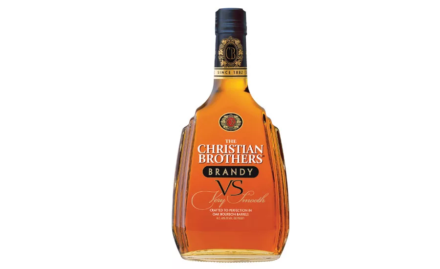
Christian Brothers Brandy has a new, premium package reflective of the American brandy’s quality. The refreshed, modern label communicates the quality of Christian Brothers, dating back to 1882, and enhances the appeal of the brand’s core equities, it says. Christian Brothers also debuted the new Endlessly Smooth creative campaign and a revamped website to showcase the new packaging across the Christian Brothers portfolio. The evolutionary label change and new creative focuses on the rich, smooth taste for which the Christian Brothers brand is known, it adds. The overall cathedral-shaped bottle remains intact, but with modernized label treatments, including a clear label, which is a departure from the previous gloss black paper background, the company explains. Key label elements such as the grapevine crest icon, Christian Brothers and “VS Very Smooth” logotypes have been upgraded with contemporary font treatments to reflect the importance of the brandy quality, it adds. To complete the new package, the gold-and-black foil neck wrap and capsule have been updated to include the “Since 1882” heritage statement with the CB grape vine crest repeated around the neck.
Looking for a reprint of this article?
From high-res PDFs to custom plaques, order your copy today!