Dogfish Head partners with Saxco on glass bottles for spirits line
Bottles offer elegant, premium appearance to craft spirit

Relaunching with a focus on made-from-scratch spirits, Milton, Del.-based Dogfish Head Distilling Co. aimed to provide a premium experience that also disrupts the craft spirits space when it introduced the first selections in its new spirits line, featuring Dogfish Head Analog Vodka, Dogfish Head Compelling Gin and Dogfish Head Whole Leaf Gin, it says.
As a part of craft brewer Dogfish Head Brewing Co., the distillery knew the importance of maintaining its brand’s identity when it came to the packaging design for the new spirits line. However, it also had high aspirations for the line. “We refer to this bottle design as ‘elegantly off-centered,’ an unexpected and whimsical design but done in a very elegant matter,” says James Montero, distillery manager at Dogfish Head.
While Dogfish Head handled the creative concept portion of the packaging design process, it turned to Horsham, Pa.-based Saxco International LLC to bring its concept into fruition. The company served as a single point of contact and assumed responsibility for the technical execution of the design, according to Saxco’s Rob Belke, vice president of sales and marketing, and Eric Guli, project manager of supply chain.
At the time of the launch, Christian Maute, Saxco’s Mid-Atlantic sales manager, said in a statement, “Our role was to help create an attractive and colorful new package that would also deliver a bold and distinctive shelf appearance and bring the project to fruition within the required timeline and budget parameters.”
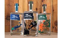
Closely working with the distillery’s marketing and design team, Saxco helped to create a high-quality, private mold square-shaped flint 750-ml bottle with flat shoulders and a premium, thick glass base.
“We studied the category very closely and determined that the round bottle was generic, with the squat round bottle being overplayed in the world of craft spirits,” Dogfish Head’s Montero explains. “We purposely chose the custom square bottle shape, as the hard angles convey elegance. We thought it [was] sort of disruptive for what you’d expect from Dogfish Head, a brand built around a round bottle experience (i.e., the beer bottle).”
Saxco then provided the distillery with a reliable overseas source to produce the bottle, which incorporated a prominent embossed Dogfish Head logo on its right-hand side, the company says. It also worked with the glass manufacturer when the embossment on the bottle needed to be tweaked, Belke and Guli say. They explain that the embossment needed to be made larger and bolder in order to really stand out. Minor changes also were made to make the bottle’s shape more distinct, they say.
“We internally agreed on [a] preferred design concept, [and] then engaged with a variety of bottle suppliers to determine the best fit for developing this custom bottle,” Montero says. “Dogfish Head led the creative side of bottle development, and Saxco brought in the engineering and recommendations on how to translate our concept into an actual product and ensuring the quality expectations were delivered.”
The weight, embossment and sharp corners were essential tactile aspects to make the bottle unique to Dogfish Head’s three spirits. “We wanted to create a bottle [that] stood out from [the] cluttered competitive space using elements of design, which create a very tactile experience to the touch — sharp angles, embossing, screen print plus [a] paper label, [a] wooden closure [and] heft,” Montero says. “We believe a consumer’s experience of holding the bottle should be nearly as much fun as sipping the liquid inside it and [in] clearly communicating to consumers that the quality and care they have always enjoyed in Dogfish beer is being applied to [its] spirits, too.”
At the same time that the distillery was aiming to disrupt the craft spirits space, it also recognized the importance of maintaining its brand identity and telling its story. Montero explains that the distillery team worked with Dogfish Head Founder Sam Calagione to map out the main objectives of the design, and then drew a range of design concepts that delivered on the brand’s theme: Explore Goodness.
“‘Explore Goodness’ is at the core of Dogfish Head Distilling Co. It’s the challenge to ourselves to always use the best ingredients in the rawest form and implement an honest, analog process — similar to how we have always made our beer,” Montero says. “‘Explore Goodness’ is also a call to action for our fans to explore all [of] the delicious goodness inside the bottle.”
To entice consumers to explore the goodness of Dogfish Head, each of Dogfish Head Distillery’s spirits features a unique two-color image on its bottle, but the three spirits share in styling, fonts and the Dogfish Head Distilling logo, which is prominently located in the upper left-hand corner.
“The story board scenes on the front of Analog Vodka, Compelling Gin and Whole Leaf Gin are whimsical scenes of exploration for the finest ingredients available (giant hops under the ocean, botanicals on the moon, harvesting barley off a sheer cliff),” Montero says. “We love the juxtaposition of this whimsical story within the format of [an] elegant, square bottle.”
Looking for a reprint of this article?
From high-res PDFs to custom plaques, order your copy today!


