Packaging News: Alcohol, soft drink and tea companies release new designs
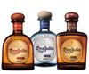
Modernized designDiageo’s Tequila Don Julio brand announced a new look for three of its five variants. Tequila Don Julio Blanco, Reposado and Añejo will each boast a modernized design that will retain the brand’s authentic cues with a new contemporary look and feel, the company says. Each new bottle has a distinct silhouette. The bottles have a new lip to enhance the pouring and have consistent embossing across the traditional hand-blown Mexican glass bottles, it says. The display of the batch number is more prominent to emphasize the handcrafted quality and the variant is more clearly displayed on the neck of the bottle. The outer packaging underwent modifications as well: Blanco is packaged in a royal blue box, Reposado in rich burgundy and Añejo in deep brown.
Standout packaging
Rainforest Beverages is debuting its Rainforest Cola in 12-ounce Rexam Sleek cans. The 100 percent natural, antioxidant soft drink will be packaged in the Sleek can for differentiation and to help the beverage stand out on the retail shelves, the company says. The cola cans feature a tall, slender design and include a red-eyed tree frog as part of the design.
Classic look
Santa Cristina is returning to its roots with a classic new look and more modern wine style beginning with its 2009 reds and 2010 whites. The new labels convey the brand’s charm, heritage and tradition, the company says. The 2009 Sangiovese’s label features an off-white background and combines the use of gold and red for lettering and imaging. Wines in the new package are scheduled to be on shelves and in restaurants in March and April. The U.S. releases are: Santa Cristina’s 2009 Sangiovese Toscana IGT, 2010 Campogrande Orvieto DOC Classico, 2010 Pinot Grigio Sicilia IGT and 2009 Chianti Superiore.
Nice and chilled
Johnnie Walker, a Diageo brand, created a new way to serve its Gold Label Whisky - chilled. French design agency QSLD Paris created the outer pack, which is dedicated to this new serving technique. Consumers can freeze their bottle and put it into the Johnnie Walker Ice Pillar to keep the bottle chilled. The inner box is inspired by frosted gold leaves that symbolize Gold Label, and the outer box is transparent to depict the ice wrapping the item, the company says. The Ice Pillar is covered by a metallic gold anodized ring. The ring repeats the slanting dynamics, makes the product and brand identifiable and is used for closing the case, the company says. Embossed on the packaging, are the brand’s logos.
Refreshed label, bottle
Averna announced a new bottle design that includes a refreshed label and bottle shape for its natural liqueur. The new bottle is taller and slimmer with a more contemporary take on the traditional that evokes a more premium look and feel, the company says. The new design will reach American stores and restaurants in the beginning of 2011. Updating the packaging is part of a larger campaign to reinvigorate the consumption of Averna amaro liqueur neat and attract a new generation of amaro enthusiasts, it says.
Line Revamp
Choice Organic Teas announced that it is relaunching its Original line with refreshed packaging. The updated Original line appeared on store shelves in January with a revamped logo, new design features and individually labeled envelopes. Packages will feature more vibrant colors, eye-catching design, and added features on the box and envelope to showcase the company’s commitment to specialty tea, consumers and the planet, it says. Choice’s Graphic Coordinator India Nagy created the concept, design and production of the relaunch. The field of colors was polished to feature rich, gem tones, and the company worked with an independent artist for the new illustration, the company says.
Logo update
Starbucks Corp. announced that in conjunction with its 40th anniversary this spring the company will launch a new logo. The update will feature the removal of the Starbucks Coffee name and enlarge the image of the siren on Starbucks branded products. The siren will be taken out of the ring that surrounds her and the coloring associated with the image will be changed from black to the green that was previously used for the Starbucks Coffee ring. Howard Schultz, Starbucks chairman, president and chief executive officer, said in a blog post that the new brand identity will give the company freedom and flexibility for coffee and non-coffee innovations and new channels of distribution.
Identifiable color schemes
Rooibee Red Tea has added a new label design to its line of single-serve bottled teas. Each flavor of tea has its own color represented by a graphic shape inspired by the petals of the Rooibos tea bush bud, the company says. The label background uses light, neutral colors including white, beige, pale blue and pale green compared to the bright colors used for the petal graphics. The labels reflect the distinctive flavors and the bright colors are designed to make it easier to find Rooibee Red Tea on the shelf, the company says.
Looking for a reprint of this article?
From high-res PDFs to custom plaques, order your copy today!


