Goldthread launches new labels design
Refreshed logo and label design reflect brand’s heart, authenticity
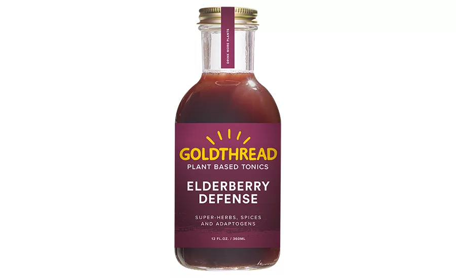
Goldthread Elderberry
Goldthread Plant-Based Tonics announced a redesigned logo and bottle label, which was created in partnership with Concept Arts creative agency. The redesign was prompted by the brand’s rapid growth phase, and the need for the branding to evolve to clearly communicate the authenticity, accessibility and joy that she says are the heart of the brand and the tonics, the company says. “Just as the tonics make a clear and lasting impact, we knew our logo and branding needed to leave a lasting impression,” said Edith Siff, chief executive officer of Goldthread, in a statement, “Concept Arts was a dream partner and truly brought the vision to life while honoring our roots. Their background in branding for the entertainment industry was a major draw for us because they are so gifted at capturing things that are experiential in nature with design.” Kristen Kamei, account director at Concept Arts, explained that their goal was to evolve the brand identity in a fresh and bold way, while encapsulating the core essence of what Goldthread brings to its customers. “Our vision was to have the soul of the product breathe through the design and make audiences feel like they were on a new adventure with Goldthread by their side,” Kamei said. “Like making new memories with an old friend.”
Looking for a reprint of this article?
From high-res PDFs to custom plaques, order your copy today!
