Milo’s Tea Co. unveils new look, updated label
Back label tells brand story and communicate product attributes
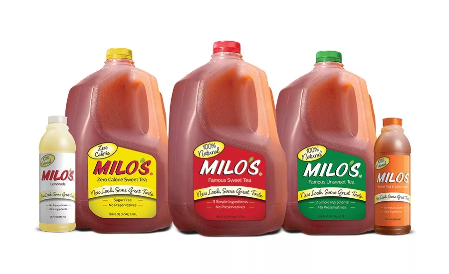
Milo’s Tea Co. unveiled a new look and an updated label design to reflect the heritage of the brand and what’s important to today’s consumers. “We are excited to debut Milo’s new packaging,” said Tricia Wallwork, Milo’s chief executive officer and founder Milo Carlton’s granddaughter, in a statement. “Our updated labels were designed with the consumer in mind, highlighting important product attributes and empowering consumers to make better, more informed choices.” The redesigned packaging reinforces Founder Milo Carlton’s philosophy of using high-quality, natural ingredients, listening to customers and never sacrificing on taste. The packaging also reminds consumers of its simple ingredient list and calls attention to what’s not in their Iced Teas: preservatives or added colors. When updating the packaging, Milo’s put the consumer at the forefront and heavily invested in quantitative and qualitative consumer research, including in-store intercepts, the company says. Thus, the scientifically created label design was based on such packaging research as visual attention analysis and attention to the Iced Tea consumer. The new label features iconography and messaging communicating to shoppers the qualities unique to Milo’s products, including the fact that the beverages are brewed with real tea leaves, are made in the United States and taste homemade, the company says. Along with the new-look front label, Milo’s has added a new back label on its gallon and half-gallon products that tell Milo’s story and illustrate the brand’s difference. The enlarged back label features icons that set the brand apart: Certified Women-Owned Business, Zero-Waste certified, BPA-free containers and a 1 Percent Profit Pledge, indicating that Milo’s donates 1 percent of its annual profits.
Looking for a reprint of this article?
From high-res PDFs to custom plaques, order your copy today!


