Packaging: Rebranding, new packaging and new sizes spark sales
While new product launches have been in a decline, rebranding, new packaging and new sizes all played a role in beverages popping off the shelf as consumers remain cautious with their discretionary spending. Trend experts at Mintel International, London, echoed those sentiments. In its 2010 Global Consumer Packaged Goods predictions, Mintel said this year’s new products will recreate the familiar, updated for today’s shoppers.
“Post-recession, we don’t expect manufacturers to reinvent the wheel,” said David Jago, director of trends and innovation at Mintel, in a statement. “Instead, we predict 2010’s new products will give shoppers something familiar paired with something new to better satisfy their needs. On retail store shelves, we expect today’s familiar megatrends — health and wellness, convenience, sustainability — to get a fresh, new makeover for 2010.”
More options for consumers
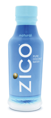
While competition in the coconut water category continues to increase, Zico, Hermosa Beach, Calif., released a new on-the-go package for its Zico Pure Premium Coconut Water. Previously packaged only in Tetra Pak containers, Zico now is available in a 14-ounce plastic bottle as well.
The new Zico bottle is designed for athletes and people who live active lifestyles, says Mark Rampolla, Zico’s chief executive officer and founder. The new bottle still features 100 percent natural coconut water, but it also contains 20 percent fewer calories per ounce than Zico’s original products and additional naturally occurring sodium to help prevent dehydration and muscle cramps.
“While Zico will continue to be sold in its original Tetra Pak [carton], we know that Zico consumers lead active lifestyles and many have specifically requested that we make Zico available in a bottle,” Rampolla says. “Zico’s new bottle appeals to these consumers as it offers on-the-go consumption, increased durability and a re-sealable cap. It is also sized for cup holders in cars and gyms.
“The plastic bottle does not change the positioning of the brand, but it does help the brand appeal to a larger range of consumers, who were previously not purchasing coconut water because of the packaging. The new bottle allows consumers to enjoy the benefits of Zico with the convenience of a sports drink.”
Zico is the only 100 percent coconut water on the market available in an on-the-go bottle, and the company also believes it is the first all-natural aseptic bottled coconut water, Rampolla says. The new bottles are made of High Density Polyethylene (HDPE) and are recyclable. A portion of the Zico bottle also is made from recycled content.
To attract more picnic and poolside goers, Gold Peak, a brand of The Coca-Cola Co., Atlanta, relaunched its glass bottled tea line in 18.5-ounce plastic bottles.
“Gold Peak’s new offerings provide classic iced tea pleasure any place, any time of the year,” said Mark Pitts, vice president and general manager, coffee and tea for Coca-Cola North America, in a statement. “Gold Peak’s real brewed premium flavor really comes through in this new chilled version, and the new plastic bottles make the single-serve Gold Peak even more portable.”
In addition, the line introduced Gold Peak Chilled Tea in a 59-ounce plastic carafe.
Smaller sizes
To coincide with the reformulation of its Spritzers brand, R.W. Knudsen Family, Chico, Calif., hit store shelves this spring with fewer calories, updated packaging and carrying case, and a redesigned look. Based on consumer feedback, the company changed Spritzers’ traditional 12-ounce can to a 10-ounce slim can for a more modern look, it says. The can’s updated design portrays realistic fruit images because the product is made from all-natural fruit juice and sparkling water. The products include no artificial ingredients or added sugar, so the consumer is getting fruit as the label depicts, the company says.
In addition to the smaller size can, R.W. Knudsen Family now is offering a four-pack with a recyclable paper wrap, rather than a six-pack. The smaller pack size allows for a more approachable price point, especially for consumers that may be new to the natural beverage category, the company says.
Coca-Cola also released smaller sized options for consumers. This winter, the company debuted a 90-calorie Mini can. The 7.5-ounce Mini can is available in Coca-Cola, Diet Coke, Caffeine-Free Diet Coke, Coke Zero, Sprite, Sprite Zero, Fanta Orange, Cherry Coca-Cola, Barq’s Root Beer and Seagram’s Ginger Ale and sold in eight-packs. The Coca-Cola Co. launched the calorie-controlled cans as a way to remind people about the importance of moderation and calorie management, the company says.
Additionally, Coca-Cola expanded its Minute Maid Enhanced Juice and Juice Drink line by going smaller to appeal to on-the-go consumers. Minute Maid Enhanced introduced three of its most popular varieties — Minute Maid Pomegranate Blueberry Flavored 100 percent Juice Blend of 5 Juices, Minute Maid Pomegranate Lemonade and Minute Maid Strawberry Kiwi Flavored Juice Drink — in 12-ounce shrink-wrapped single-serve bottles. The three varieties of Minute Maid Enhanced juices also are available in 59-ounce PET bottles.
“By launching our most popular varieties of the Minute Maid Enhanced Juice and Juice Drink line in a chilled single-serve, we will continue to meet the needs of health-conscious consumers with a new, convenient package,” said Mike Saint John, president of the Minute Maid business unit, in a statement.
New branding
Another way beverage companies are hoping to differentiate their products is through updated and clearer branding. Uncle Matt’s Organic, Clermont, Fla., debuted a new brand vision of “fueling families with uncompromised organic nutrition” to drive all brand marketing efforts.
“We updated the brand logo to draw in a wider audience while continuing to appeal to our core demographic of busy moms on-the go,” says Susan McLean, Uncle Matt’s Organic’s chief marketing officer, in a statement. “We believe our new direction brings out the energy and vibrance of our corporate personality while still reflecting on the strong family values we hold dear.”
Uncle Matt’s hopes the updated logo will stand out better on the shelf and bring the company’s name to the forefront, helping to differentiate Uncle Matt’s from the competition. The branding update extends to all juice products, including the company’s new 6-ounce carton and 59-ounce labels.
Aiming to create a centralized look for its organic energy drink, iced tea and sparkling green tea lines, Steaz, Newton, Pa., created new graphics for the brand. Steaz’s packaging originally featured its energy drink in a green can, its iced teas largely showcasing fruit and people representing Fair Trade farming, and its sparkling green tea line displaying a small label with fruit on it. The old packaging did not tie the branded lines together, says Lee Brody, Steaz’s vice president of marketing.
The new packaging features a logo of a symmetrical flower graphic. The graphic displays a modern-day version of flower power, the company says. “Think of our logo as a visual expression of the connections life weaves through all of us,” the company says.
In March, Minneapolis-based Caribou Coffee, unveiled a new coffee-centric logo to enhance its brand position and create new opportunities to engage consumers, it says.
The new look features a coffee bean at the heart of the signature caribou and ‘C’ shaped antlers. The animal is leaping to the right, which signifies the company’s vision and movement toward the future, it says. The logo is featured on cups, napkins, drink carriers, canteens and signage. Caribou Coffee also introduced a new tagline: “Life is short. Stay awake for it.” The tagline hopes to inspire consumers to seize the day, the company says.
“As we explored new versions of the central elements of the brand, we made sure to stay true to the heart of our company and the vision in which it was founded,” said Alfredo Martel, senior vice president of marketing, in a statement. “We are a brand that embraces living life to the fullest, regardless of what it is that you are passionate about.”
Caribou Coffee has been elevating aspects of the brand experience since Mike Tattersfield took over as chief executive officer in August 2008, the company says. “Our brand relaunch runs much deeper than the new logo design; it really signifies the evolution of our company,” Tattersfield said, in a statement. “We are passionate about and committed to creating the best cup of coffee possible and an experience that extends beyond our products. We are working to ensure that all aspects of the customer experience are at the same premium level of quality as our coffee.”
Back to the familiar
Sometimes the redesign of a beverage requires going back to its origins. First introduced in 1994, North American Breweries’ The Original Honey Brown in February returned to the same iconic label and packaging that made the beer well-known in the late 90’s.
In 2009, North American Breweries, Rochester, N.Y., learned that Honey Brown drinkers were unhappy with Honey Brown’s packaging. In focus groups and e-mails, beer drinkers asked the company ‘Where did Honey Brown go?’ says Jason Drewniak, brand manager for The Original Honey Brown.
“Beer drinkers did not realized that Honey Brown remained in the beer cooler all this time, just in packaging that was very different than its past design,” he says.
Honey Brown’s labels and packaging changed dramatically in June 2008, when the familiar brown, orange and red shield was replaced with a bright yellow color and a marching bumblebee.
“The yellow color was not consistent with Honey Brown’s historical colors,” Drewniak says. “The bumblebee design was more appropriate for a craft beer. The name of the beer was moved to the bottom of the packaging. This combination created an environment where beer drinkers looking for their beloved Honey Brown had to work harder to find it. Many gave up altogether and switched to another beer; many contacted North American Breweries and we are happy they were upfront with us.”
Marketed in the super premium beer category, Honey Brown now features a design almost exactly as it appeared when it was first introduced. Honey Brown hopes to stand out from competitive beers because of the colors: the orange stripe on the six-pack and 12-pack and the Honey Brown name in a white font that contrasts brightly to the orange background, Drewniak says. Additionally, the bottle labels are printed on metallic paper, making the brown, orange and red colors pop, he says.
“The new ‘old’ look is full of features that we have owned since 1994: the ‘shield’ shape of the brand, the three stacked barrels, the brown, orange and red colors, and the word ‘Original,’” Drewniak says. “‘Original’ is an important adjective to the brand because Honey Brown was one of the first beers to use honey as a beer ingredient, and we are using the design from the original packaging.”
Big Red Inc., Austin, Texas, also took a turn back to the past by giving Big Red Vanilla Float a makeover with a nostalgic soda fountain look. The soft drink keeps its same vanilla float taste, but now features a cartoon fountain server holding a Big Red Vanilla Float.
“The new look of Big Red Vanilla Float serves as a reminder of the origins of the soft drink history associated with our products,” said Jack Pok, Big Red Inc.’s chief marketing officer, in a statement. BI
Related Links:
New packaging launches get smaller, sportier and sexier
Feb. 2010 Packaging: 360-degrees of graphics grab attention
Jan. 2010 Packaging: Caps and closures move innovation to the top
Looking for a reprint of this article?
From high-res PDFs to custom plaques, order your copy today!


