Stash Tea redesigns portfolio’s packaging
Bright colors, bold ingredient imagery utilized for new look
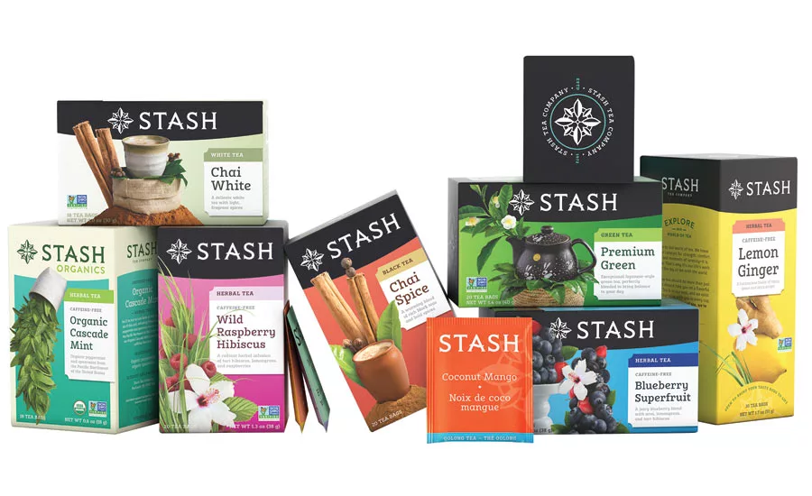
Stash Tea is celebrating a year of major milestones, including a rebrand unveiled in 2018. The company has redesigned its packaging while continuing to roll out in tea aisles across the country. Leaning on the company’s long-standing commitment to flavor, quality and creativity, the brand’s new look centers around bright colors and bold ingredient imagery representative of key tasting notes, it says. Nami Yamamoto, chief executive officer for the company, noted that the aim of the rebrand was to rethink not just how the packaging looks on store shelves, but how to better communicate Stash’s long-standing core values to the consumer. “Giving the ingredients center stage emphasizes our commitment to using only natural, healthy ingredients to create delicious and unique flavors,” Yamamoto said in a statement. “As we evolve as a brand, our hope is that we continue to excite consumers to explore the incredible world of tea that inspires us every day.” One challenge of the brand refresh was bringing Stash’s 46-year heritage into today’s modern market. The existing compass rose logo was streamlined and adorned with tea leaves — establishing a new visual identity while maintaining the brand’s adventurous and worldly spirit, the company says. The compass is meant to inspire consumers to look to their daily cup of tea to help them find their “true North” and a sense of balance in today’s busy world, it adds.
Looking for a reprint of this article?
From high-res PDFs to custom plaques, order your copy today!


