Bud Light to launch packaging redesign
Brand's first redesign in 8 years
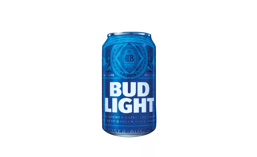
Bud Light announced the first major overhaul of its visual identity in eight years as part of a larger brand evolution underway. The redesign includes a reimagined Bud Light logo and contemporized primary and secondary packaging. By bringing back the brewer’s trademark “AB” crest — not used on Bud Light packaging since 2001 — the design emphasizes the brand’s premium ingredients; care in brewing; crisp, clean finish; and smooth drinkability, the company says. “In 2016, we’ll put a more modern twist on Bud Light, from the way the brand looks to the way it acts,” said Bud Light Vice President of Marketing Alexander Lambrecht, in a statement. “We’re proud to introduce our fresh new look, which pays homage to our most iconic packaging of the past, yet feels current and unique with its bolder logo and distinctive blue colorway. It’s a design that truly stands out from what’s become a sea of sameness in the light beer category.” The new Bud Light packaging rolls out nationwide in cans and glass and aluminum bottles in early spring.
Looking for a reprint of this article?
From high-res PDFs to custom plaques, order your copy today!


