Barrie House releases new product lines, branding
Burgundy color celebrates the shade of the coffee cherry at its ripest
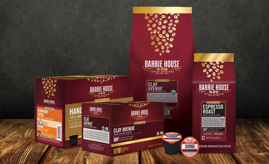
The family-owned, third-generation Barrie House Coffee Roasters announced a new product line and a rebrand of their logo and packaging. The rebrand reflects the New York-based coffee roaster’s commitment to coffee farmers and the burgundy brand color pays tribute to the coffee cherry, it says. Barrie House’s new branding and logo include a graphic of three coffee beans representing the three generations and the current three brothers that own the business: Barry, Paul and Ronald Goldstein. The burgundy packaging color celebrates the shade of the coffee cherry at its ripest. In fact, the inspiration for the color came from a colored bracelet that some farmers wear, according to the company. During harvest, they compare the color of the coffee cherry to the color of the bracelet. If it matches, then the cherry is ripe and should be picked. The gold accents on the logo and packaging communicate the premium positioning while also giving a nod to the Goldstein family name. Furthermore, their new flagship blend is named Clay Avenue for the NYC street in the Bronx where the company was once located and where Barry Goldstein grew up. “We truly believe that our new product line and branding reflects our mission to inspire a great coffee drinking experience, while conducting business in a manner that is socially and environmentally responsible,” said Craig M. James, chief executive officer of Barrie House Coffee Roasters, in a statement. “We hope everyone enjoys each and every cup just as much as we do.” Barrie House’s premium line of Fair Trade Organic coffee is available across three collections — Estate Blends, the Signature Collection and Single Origins Collection — along with a Seasonal Flavors line of conventional coffees infused with the familiar flavors and aromas of fall and winter. The coffees are packaged in 10-ounce and 2-pound bags, and 10- and 22-count single-serve pods that are Keurig 2.0-compatible.
Looking for a reprint of this article?
From high-res PDFs to custom plaques, order your copy today!


