The Best Beverage Packages of 2016
Voss, Coca-Cola, Dr Pepper among Top 5 best packages

Packaging is a key marketing element for any beverage brand when launching a new product, a package redesign or for a marketing campaign.
The Beverage Industry editors examined this year’s new products and package redesigns and narrowed the list to the Top 11 packages from 2016. These 11 packages were then put to a reader vote on bevindustry.com. After the polls closed, the following Top 5 were selected as the Best Packages of 2016.
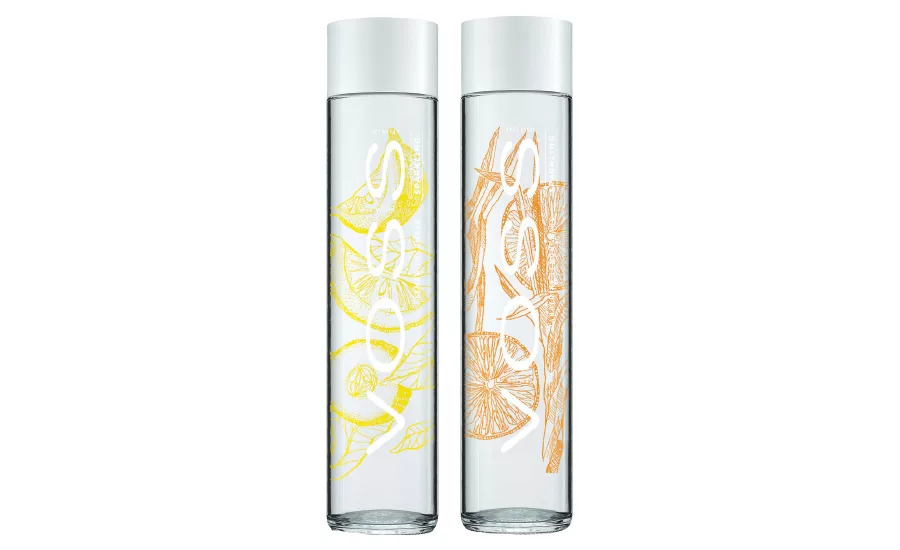
Voss Sparkling Flavored Water
With 48 percent of the vote, New York-based Voss Water of Norway took the No. 1 spot with the packaging design for its flavored sparkling waters, which launched in the spring. To create the packaging for the new line extension, the company enlisted the help of New York-based Spring Design Partners, explains Chief Marketing Officer Ken Gilbert.
“Spring Design Partners, based in New York, started the process with terrific strategic insights and nursed us through to a design that represented a comfortable deviation for what we consider to be the sacred cow — our golden goose,” Gilbert says.
In order to create the look for the new line extension, the companies built on the premium appearance of the brand’s iconic glass bottle. “There were several factors [considered],” Gilbert explains. “First of all, we had to maintain the high-quality, iconic look that is the brand’s best asset, [and] then maximize the use of glass.”
The packaging for the line extension features a pearl cap and bold color illustrations of the infused flavors. “The cylindrical straight-side construction of the bottle allowed the fruit visuals to be on the back of the bottle, which gave the impression that Voss Flavored Sparkling is infused with fruit flavor,” Gilbert says.
Since the launch, the packaging has been well received, the company says, “[The packaging] helped to achieve good launch distribution levels in retail, opened up new accounts in on-trade hotel and restaurants, and consumers really get it and perceive the product as was intended,” Gilbert says.
Pasote Tequila
Capturing 18 percent of the vote, Pasote Tequila, a brand of Sonoma, Calif.-based 3 Badge Beverage Corp., took second place for its handmade 750-ml glass bottles. The packaging conveys the heritage and authenticity of the line of Mexican tequilas named for the fierce spirit of the Aztec warriors, says August Sebastiani, president of 3 Badge Beverage Corp.
To do this, the Pasote label features bold, hand-screened graphics of distinct warriors. The Blanco varietal features the Aztec Sun God Tonatiuh; while the Reposado features an Aztec Jaguar Warrior; and the Añejo features an Aztec Eagle Warrior.
“We did some research on the history of the spirit and some Mexican history,” Sebastiani explains. “… We wanted to have some punch to it, some flair if you will, but also some authenticity and some connection to the process.”
Enhancing the packaging’s connection to the process, each bottle is custom made and has distinctive, slightly asymmetrical wave patterns visible in the glass. “That authenticity comes through in the glass,” Sebastiani says. “[The bottles] are hand-blown, and there’s more than a bit of variance from one bottle to the next, both in stature — they lean a little bit from the nature of the cooling of the glass — and in the imperfections and the texture within the glass. It’s those imperfections that I think speak to the handcrafted nature [of the spirit].”
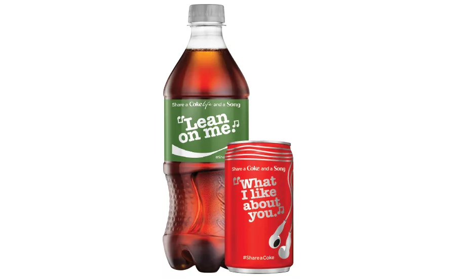
Coca-Cola Share a Coke and a Song
Successful campaigns also can be driven through the use of limited-edition packaging designs. Atlanta-based The Coca-Cola Co. took the No. 3 spot with 11 percent of the vote for its Share a Coke and a Song campaign packaging.
“We share songs with each other because lyrics speak when we can’t find the words ourselves or simply because a song reminds us of that person,” says Jason McAlpin, brand manager of Coca-Cola. “Sharing a song was a perfect extension of our successful Share a Coke campaign, so we worked to design packaging that made music come alive on Coca-Cola bottles and cans.”
This summer, the company launched packages of Coca-Cola, Diet Coke, Coke Zero and Coca-Cola Life featuring an array of song lyrics. “Our goal with the Share a Coke and a Song design was to deliver music in a visual way — we needed to do more than simply printing song lyrics on our packages,” explains Frederic Kahn, design manager at The Coca-Cola Co.
To create the graphics, the company enlisted graphic designer Noma Bar, Kahn says. “Noma Bar … was tasked with combining the turntables and vinyl records of the past with the earbuds and stereos of today to incorporate as much fun, musical iconography as possible, hence the music notes as quotation marks, the red Coca-Cola ribbon as earbud wires and so on,” he says.
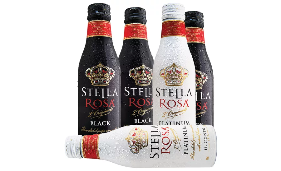
Stella Rosa Wine
Highlighting the growing trend of canned wines, Los Angeles-based San Antonio Winery took the No. 4 spot with 7 percent of the vote for its single-serve, 8.5-ounce aluminum bottles of Stella Rosa Wine Black and Platinum varietals, which launched this summer.
The company chose the aluminum bottle because of its shape, explains Anthony Riboli, fourth generation winemaker. “We also wanted to maintain our higher-end image and felt these sleek bottles were perfect,” he says. “Being resealable also makes them reusable and thus environmentally friendly, as well.”
To give the package a premium look, the company incorporated elements from its Stella Rosa glass bottles into the design of the aluminum bottles, Riboli says. “Certainly we wanted to maintain the classy image of our Stella Rosa brand in glass bottles, so we kept similar images, like the crown, but being able to print on aluminum, we were given amazing flexibility to explore vibrant colors,” he says.
Due to the success of the initial launch, the company is planning to offer a semi-sweet Rosé and Stella Rosa Pink in the same packaging, Riboli says.
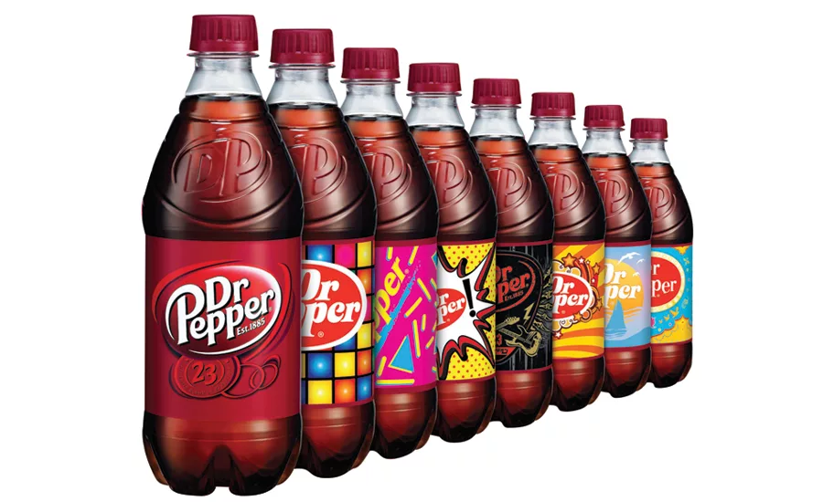
Dr Pepper Pick Your Pepper
Plano, Texas-based Dr Pepper Snapple Group (DPS) took the fifth spot with its limited-edition Pick Your Pepper campaign packaging. The custom labels on 20-ounce bottles of Dr Pepper launched this summer and garnered 6 percent of the vote.
“The true inspiration for the Dr Pepper’s Pick Your Pepper labels were first and foremost millennials,” says Brian Bell, brand public relations of brand entertainment and talent at DPS. “They were designed, reviewed and approved by millennials to tap into their enthusiasm for self-expression and encourage consumers to choose the labels that best fit their personality, mood or passion.”
The labels utilized unique digital technology, in which text, graphics and images can be changed from one printed piece to the next in mass quantity, the company says.
“Consumer responses to the labels have been overwhelmingly positive with thousands of consumers posting images on social media with their favorite design,” Bell says. BI
Looking for a reprint of this article?
From high-res PDFs to custom plaques, order your copy today!


