You have 0 Articles Left This Month. Register Today for Unlimited Access.
Get our new eMagazine delivered to your inbox every month.
Stay in the know on the latest beverage industry marketplace trends.
SUBSCRIBE TODAY!Copyright ©2024. All Rights Reserved BNP Media.
Design, CMS, Hosting & Web Development :: ePublishing
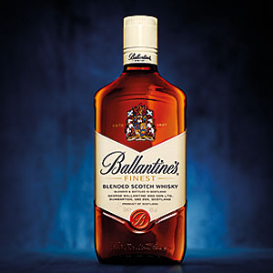
 wings of the historic Finest label; a more prominent positioning of the brand’s crest; a simplification of the Ballantine’s seal, which amplifies the Ballantine’s “B”; and the transition of the word “Finest” to a more premium gold coloring. The shoulders of the bottle also have been made more angular, resulting in a sharper, prouder look, the company says. As a result, the bottle enhances the brand’s most familiar elements while achieving a more contemporary look, it adds.