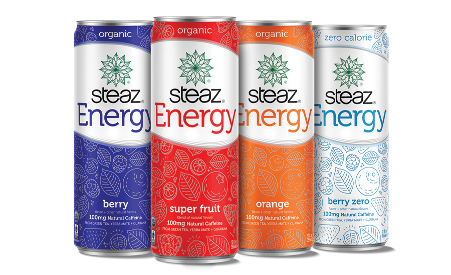
After introducing a re-brand of its energy line in September 2016, Steaz recently launched a new look for Steaz Energy in stores across the country. The line’s new visual identity showcases easy-to-read, clean labels and an original design that defines all of the brand’s flavorful and functional beverage platforms, the company says. The new Steaz Energy can design prominently displays the brand’s defining characteristics with features including “certified organic,” “Fair Trade,” and “energy,” ensuring that consumers seeking such products know what they’re getting with a can of Steaz Energy, it says. “We believe it is important to make it easy for our customers to make better beverage choices, and clean labels are a major priority for us,” said Linda Barron, chief executive officer of Steaz, in a statement. “The new Steaz Energy can design is aligned with the branding, messaging and aesthetics of our entire line of popular beverages, with labeling that reflects Steaz’s dedication to quality and transparency that we can confidently say is now consistent across our whole portfolio.”
Steaz launches package redesign for energy line
New look better defines clean label, functional platforms