Spindrift unveils new packaging
Fruit at the forefront of packaging design
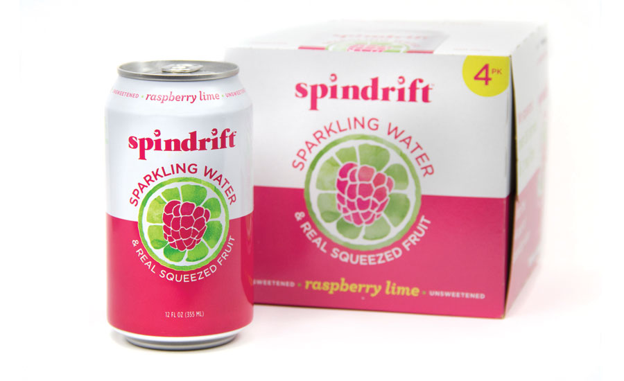
Spindrift unveiled new packaging for its self-titled beverages. “We were the first to directly challenge the market with fresh ingredients and with so much evolution in the category, it is now more important than ever to communicate our unique use of real fruit in our package design,” Spindrift Chief Executive Officer and Founder Bill Creelman said in a statement. Designed to showcase the fact that there is real fruit in every bottle, the graphics on the new labels put fruit at the forefront of the packaging, with beautifully rendered watercolors against a pure white backdrop, the company says. Additionally, the packaging uses colors that are symbolic of each of the fresh-squeezed fruits inside.


