Rittenhouse Bottled-In-Bond Straight Rye Whisky is getting a label redesign with graphic elements from its original post-Prohibition packaging. Designed to create a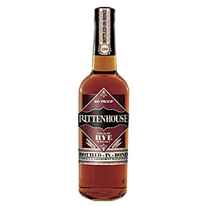 more premium look that reinforces the authenticity and historic significance of the brand, the new labels and capsule closure evoke the Art Deco style of the 1930s, the company says. The new labels maintain the burgundy and black color palette and the brand logotype but utilize them in a redesigned face label that is based on classic Art Deco Rittenhouse Rye labels of the 1930s, when the brand was known as Rittenhouse Square Rye, the company says. The main graphic motif that has been revived from the original packaging is the diamond geometric design around the logotype, which also contains the “100 proof” and the “Straight Rye Whisky” designations, which also were featured on the original post-Prohibition labels. The redesign also brings back the tax stamp, which was originally mandated as proof of the “bottled-in-bond” status, with a printed neck capsule that adds a classic and more upscale feel, it adds.
Rittenhouse Bottled-In-Bond Straight Rye Whisky reverts to post-Prohibition packaging style
New packaging features Art Deco style, old-fashioned tax stamp