Packaging is as nuanced as the culture it speaks to. Its solutions are shaped by shifts in popular culture, scientific breakthroughs, and the marketer’s need to fill their pipeline with a steady stream of groundbreaking innovation. A consumer need can even ignite a whole new category.
I experienced this in the 1970s while working with Hal Riney on the launch of Henry Weinhard’s Private Reserve. Hal’s work and the product itself seeded the craft beer revolution that we still enjoy today.
Sometimes the innovation has gone too far. In the early 1990s, marketers and consumers were in love with the novelty of clear products. Suddenly variety and colorful additives were getting passed over in favor of clarity, lightness, and perceptions of purity.
At this same time, with light beer sales reaching a fever pitch, Miller Brewing Co. began tinkering with their filtering process and succeeded in producing a low-calorie, low-carbohydrate beer that was completely clear. “Hey, Boss, how's about clear meat?” someone joked, and the drinkers laughed.
Test marketing the new Miller Clear Beer began in Austin, Texas; Minneapolis; and Richmond, Va. The brief was simple — highlight the clarity of the beverage to combat the negative image of beer as being overly heavy and too filling. In short, design and telegraph lightness and refreshment.
The thinking was that Miller, as a product endorser, would deliver authentic beer cues while the clear beverage also would convey lightness and refreshment, giving the product an edge over low-calorie competitors. Concerns about taste perceptions were brushed aside with a mountain of research claiming lightness was the coming king and that taste had been pre-validated.
Unfortunately, the product did not resonate with consumers. It is true that we taste with our eyes and, unfortunately, when consumers poured an ice cold Clear into a frosty mug, all too often they saw a glass of sudsy water.
From glass to bag-in-box
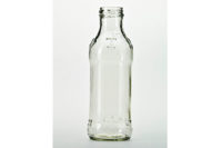
How do you create a package that moves an excellent product from the shelf to the consumer, while still maintaining the package’s integrity as a vessel with flawless protection of the product? Clarity can be the answer. Glass has earned its distinction as the premiere packaging form for beverages because it creates an excellent oxygen barrier and enhances product stability on shelf. It allows consumers to judge the product with their own eyes. Items packaged in glass offer a wholesome or homemade perception. Beverages can look colder, more refreshing and more elegant in glass than products in other types of packaging. However, glass’s strength-to-weight ratio is inferior to paper or plastic. Graphics often are printed on a secondary label, which increases the cost of goods and rarely takes advantage of the package’s full real estate.
Wine producers have struggled with finding alternatives to glass packaging. The best alternative appears to be the bag-in-box or “wine box,” which has been around since the late 1960s. Despite the historically low-quality reputation of wine bottles wrapped in attractively designed boxes, there are many compelling advantages for doing things this way: good shelf-stability after opening; improved functionality in large formats; less packaging waste; and cost savings, which are passed onto the consumer.
On the other hand, without the ability to see the wine through the box, designers have to work that much harder to represent what is inside. As with beer, we often use wine’s color cues to denote flavor, texture and finish. In addition, carefully applied details like foil, ribbon, elaborate die cuts, and richly textured paper help underscore quality messages and reinforce a sense of rarity, care and the idyllic beginnings associated with wine.
Recently, a few companies achieved promising results. The Wineberry wooden wine box with its hand-applied label comes across as a personal wine cask. Four Wine’s cylindrical tube, fine matte paper appearance, and metallic gold detailing bring traditional wine material cues to the category.
Inspired by these new ideas, our own team is experimenting with new ways of integrating natural materials into box-in-bag structures that conjure up familiar cues like cork, burlap and straw to leverage sensory references that authentically sing out a real wine taste.
At the end of the day, a beverage package is a vessel that must deliver a promise. No matter how colorful your design, the customer will not return for repeat sales if the product does not live up to the expectations you create. So goes the product and sometimes the company. I close with my final succinct words: The package is the product, brand is the authority, and perception is reality. Do that right, and you can take it to the bank.


