Pernod Ricard USA released a new look for its Ballantine’s Finest Blended Scotch Whisky. New design elements include a chevron-shaped label that recalls the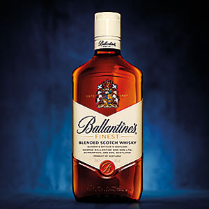 wings of the historic Finest label; a more prominent positioning of the brand’s crest; a simplification of the Ballantine’s seal, which amplifies the Ballantine’s “B”; and the transition of the word “Finest” to a more premium gold coloring. The shoulders of the bottle also have been made more angular, resulting in a sharper, prouder look, the company says. As a result, the bottle enhances the brand’s most familiar elements while achieving a more contemporary look, it adds.
Pernod Ricard USA redesigns Ballantine's bottle, label


