|
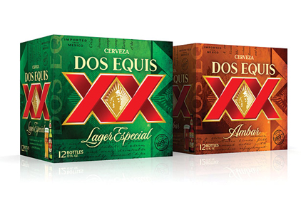
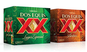
Heineken USA announced that the bottles, cans and secondary packaging for its Dos Equis Lager and Dos Equis Ambar brands have been redesigned. Changes to the bottles and cans include an updated typeface of the iconic “XX” and rays on the front label to increase brand visibility; a profile of Aztec leader Moctezuma facing left to right, representing the brand’s momentum and forward thinking; and the addition of a heritage line on the front label to highlight Dos Equis’ story, the company says. Changes to Dos Equis’ secondary packaging design include a front-facing brand logo and a background with various images and text that communicate the brand’s heritage and authenticity. The addition of the Dos Equis bottle and the hand-blown draught glass to the side panel highlights the beer’s color, strengthens the visual appeal and helps to distinguish the differences between Dos Equis Lager and Dos Equis Ambar, the company adds.
