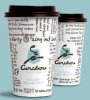
Minneapolis-based Caribou Coffee, unveiled its new coffee-centric logo Monday. The new imagery is part of the company’s strategy to enhance its brand position and create new opportunities to engage consumers, it said.
The new look features a coffee bean at the heart of the signature caribou and ‘C’ shaped antlers. The animal is leaping to the right, which signifies the company’s vision and movement toward the future, it said. The logo will be featured on cups, napkins, drink carriers, canteens and signage beginning this month. Caribou Coffee also introduced a new tagline: “Life is short. Stay awake for it.” The tagline hopes to inspire consumers to seize the day, the company said.
“As we explored new versions of the central elements of the brand, we made sure to stay true to the heart of our company and the vision in which it was founded,” said Alfredo Martel, senior vice president of marketing, in a statement. “We are a brand that embraces living life to the fullest, regardless of what it is that you are passionate about.”
The company has been elevating aspects of the brand experience since Mike Tattersfield took over as chief executive officer in August 2008, it said. This week, Caribou Coffee launched new Tea Latte Fusions. Available in Caramel Earl Grey, Black Thai, Cinnamon Rooibos and Pomegranate Vanilla Oolong, the lattes combine brewed whole leaf-tea with steamed milk. Last fall, Caribou Coffee unveiled a menu of reformulated chocolate beverages made with all-natural gourmet chocolate from Guittard Chocolate Co., San Francisco.
“Our brand relaunch runs much deeper than the new logo design; it really signifies the evolution of our company,” Tatterfield said, in a statement. “We are passionate about and committed to creating the best cup of coffee possible and an experience that extends beyond our products. We are working to ensure that all aspects of the customer experience are at the same premium level of quality as our coffee.”


