Sweet Leaf Sweet Tea
Sometimes a package needs a little tweak here and there to stay fresh; other times it requires a complete overhaul. Either way, redesigning an existing brand is a balance between creating a new look and not alienating loyal consumers who are accustomed to seeing a product a certain way.
“You have to hold on to the roots of the company and what’s iconic,” says Peter Burns, general manager at Celestial Seasonings, Boulder, Colo., which updated many of its tea packages this spring.
“It’s really a balance of keeping the old and the history, but also becoming a little bit more modern and making sure you’re appealing to the modern need of the consumer,” he says.
Celestial Seasonings rotated the graphics on its tea boxes from a vertical design to a horizontal design, created entirely new graphics for its Green Tea line and updated graphics on its Wellness Teas as well. Both lines include banners across the top of the package for unity and stronger shelf impact.
“The toughest thing about the specialty tea category is it’s very confusing to shop,” Burns says. “When you talk about segmentation, you really want to be crystal clear in what you’re communicating and giving to the retailer as well as the consumer. In the Green Tea block, all the packages are green. There’s a consistent billboard look, and there’s a big font that just says ‘Green Tea.’ It makes it much more shopable.”
The redesign also incorporated new Asian-inspired graphics on a black lacquer box, and the update included a product reformulation that added white tea to the blend for a smoother flavor. Each new package includes a smaller banner that says “with White Tea for Smooth Taste.”
“Green was a huge departure for us from where we were, and our green tea needed that,” Burns says. “It needed to be refreshed. The product needed to be reformulated, so we feel good about that.”
In the Wellness line, the company incorporated its Sleepytime herbal tea brand into the lineup with Sleepytime Throat Tamer and Sleepytime Extra. In doing so, it added some modern touches to the iconic Sleepytime bear. It also included bullet points on each package to underscore the functional elements of the product, the key ingredients and the flavor. Like the Green Tea line, the new Wellness update also uses bolder type for shelf recognition.
“Our previous Wellness packages had some characters and some animals on them that really didn’t convey the message that we wanted to convey on the package,” Burns says. “People buy Wellness tea for a specific condition — they have a cold, they have a sore throat. We really needed to make our packaging more modern and deliver that message to the consumer.”
All of the new Celestial packages are expected to be on store shelves by summertime.
New look for new markets
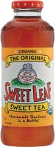
At Sweet Leaf Tea, Austin, Texas, creating a new package design was a matter of establishing its independence. The company was tired of people pointing out that it’s old bottle was the “Snapple bottle.”
“We felt we’d grown up, moved out of our parents’ house and it’s time to have our own place,” says Chief Executive Officer Clayton Christopher.
“That’s especially important as we’re going into new markets where people haven’t seen us before,” adds Craig Steckbeck, senior art director for Sweet Leaf. “Especially in the Northeastern markets, a lot of the folks associate that generic bottle with the old Snapple stuff. Also, it’s just having something unique that we can call our own. It’s a completely proprietary new shape with embossing, so that’s really going to set us apart.”
The new taller bottle created space for bigger labels as well, and the company used the extra room to update graphics and include more information about its business. The new labels still feature Granny — based on Christopher’s real-life grandmother — but they now provide some background on her association with the brand.
“We’re going to bring that story to life a bit, give her a name,” Christopher says. “That will be a universal story that will be on all the flavors, and then we’ll have a second story that’s going to be unique to the individual flavors.”
The bottle will lose the vine motif that encircled previous labels, as well as the background leaf pattern. In their place will be a horizontal stripe element, color coded by flavor, that will be carried across the entire line to create a billboarding effect on the shelf.
Sweet Leaf surveyed consumer focus groups on the package changes, giving more weight to consumers in areas of the country in which the brand does not yet have distribution.
“What we were most concerned about was the opinions of the people who had never heard of us before, because that’s still the majority of the population of the United States,” Christopher says.
Steckbeck adds, “The real advantage to us getting into a new package is going to be the new consumers that come to the brand, the people who notice us on the shelves.”
Sweet Leaf expects the new bottles to be on store shelves in early June.
The one-second rule
Cell-nique, Weston, Conn., also expects to roll out new packaging this summer, with new labels for its Cell-nique Super Green Drink. The redesign came in two phases, beginning with functional changes to the bottle last spring that took the brand from a tall slim bottle to a broader bottle with a vacuum-sealed cap. Dan Ratner, “head greenologist” at Cell-nique, says the cap changes were led by the company’s quality assurance requirements, and the broader bottle made the package less likely to tip over on the shelf.
Graphics then were redesigned to convey a stronger brand message.
“We felt that people have one or two seconds for shelf recognition,” Ratner says. “[The product has] got to grab somebody’s attention, either in terms of familiarity or to pique their interest level. You’ve got one or two seconds, tops, to be able to do that.”
Cell-nique kept many of the colorful graphics it had established with its original brand rollout, but put “Super Green Drink” at the top of the bottle. Ratner says many consumers in the natural foods channel understand the concept of a green drink, but many do not, so it also added “31 Vegetables & Fruits” around the individual flavor icons. This served to both communicate the content and also to unify the line.
“That’s to try to communicate within this one second what it is and that there’s a uniformity — you can select any flavor, but you’re going to get 31 superfoods,” Ratner says.
Cell-nique expects the new labels to be added to the current Tropical Fruit, Pomegranate, Apple and Citrus Vanilla varieties in June, when the company also will release four additional flavors to the line. BI